
User experience online is very similar to the user experience you get when going to a grocery store. You want a pleasant time without any hassle. You want to be able to navigate the store quickly, get what you need right away, head to the checkout line without a wait, and get back home.
It may seem a bit corny to think of UX design in terms of going to your local grocery store, but the experiences are similar. Our customers are visitors to the sites we create, and the groceries are the content in which they came to the site for. For those of us who go to the store, it’s easy for us to pinpoint things that irritate us or think should be improved. However, when it comes to our own designs and user interfaces and the creation of them, we may not be able to point out these irritants ahead of time before users do.
At Linkeo Ltd, we fix this by taking a step back and look for these weak points in our design, so that we don’t cause clients unnecessary frustration and keep visitors on our site so they can get to the content they were looking for.
Here are a few tips to follow:
DO: Provide a similar experience regardless of the device
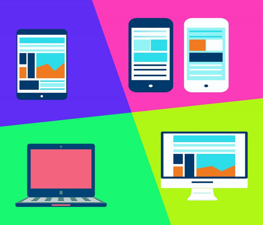
Visitors are coming to your site using many different types of devices. They can visit your site on their desktop or laptop, tablet, phone, music player, game console, or even their watches. A big part of user experience design is ensuring that no matter how the visitor sees your site, they are getting the same experience they would if they were to visit from another device. A seamless experience across all of your devices helps keep your users on your site regardless of the device they are using.
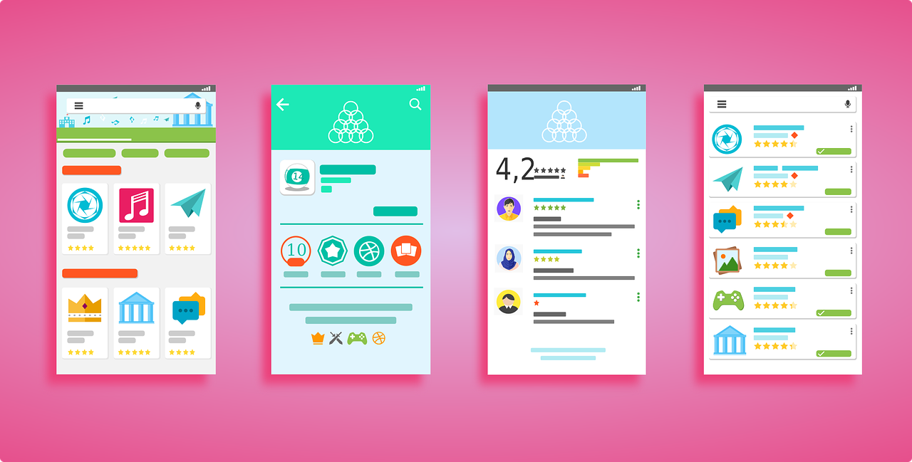
DO: Provide instantly recognizable and easy-to-use navigation
The key to providing a pleasant user experience for users is to understand that they are in search of content. Provide a user-friendly navigation system that is easy to recognize and easy to use. Design your navigation in a way that gets visitors where they want to go with the least amount of clicks as possible while still being easy to scan and locate where they need to go.
DO: Make the most important thing on the screen the focal point
Users are more likely to quickly scan the screen than they are to read everything there. Therefore, if a visitor or user wants to find content or complete a task, they are going to scan until they find where they need to go. You can help them along by designing where they eyes should focus first, second, etc. (also known as visual hierarchy). Make the important things such as screen titles, login forms, navigation items, or other important content a focal point so visitors see it right away.
DO: Let the user control their browsing experience
When you design a website or user interface, you want to let the user control their browsing and movement through the site or application. It’s been known that things such as auto-play videos, taking away a user’s ability to scroll, music or sounds in the background, and opening links in new tabs/windows irritate users. These elements should be used sparingly and only when appropriate and expected.
DON’T: Letting the design of the site hinder the site’s readability
The design of a site or user interface should never interfere with the user’s ability to consume the content on the screen. This includes having busy backgrounds behind content or poor colour schemes that hinder the site’s readability. Focus on the typography of your site to ensure issues such as line length, line height, kerning, and font choice doesn’t pose issues for readability.
DON’T: Hindering a visitor’s ability to scan the screen
As I mentioned above, users and visitors alike often scan the screen quickly before settling in to read any one particular thing with focus. Users often scan for visual cues such as headings, pictures, buttons, and blocks to know where they should focus their attention. Using appropriate headings that are easily seen, pictures to illustrate points, buttons for navigation, and blocks of content that are unique or important help users scan the screen to find what they need.
DON’T: Fill the screen with non-related content
Going back to the grocery store example, if I’m looking for flour and sugar to bake with, I want to be able to go directly to the baking aisle and find those specific things. Users of your site or interface feel the same way. They want the content they came for without any other interference or distractions. If they are shopping for a t-shirt on your site’s store, they don’t want to see ads or recommendations to buy a new phone.
DON’T: Have several things compete for attention
Much like not filling your site with unrelated content, designing elements that have to fight for attention can also cause confusion and some nervousness in your users unnecessarily. Using visual hierarchy to design the user’s flow around the screen reduces the competitive feeling of different elements. Also, not having things pop up at users (i.e. modal boxes) and other things they have to close out to read your content keeps the focus on the content.
Conclusion
Standing back to take an honest look at your site’s user experience will help greatly reduce any possible frustrations or aggravations users may experience while looking through your site or application to find content or complete a task. With these do’s and don’ts, you can help your visitors out and provide a great user experience.